Saturday, March 8, 2014

Direct vs. Indirect Lighting


I think Louis Kahn's use of deflected light is very inspirational. He speaks about the contrast between the brightness of a window and the darkness the corresponding wall. If you were to photograph the window/wall, either the window would be in proper exposure or the wall would - not both - because the luminosity difference is too great. But what if you had a window and then to either side of the window were windows with walls in front of them? The windows with walls in front would allow light to enter and reflect off the back of the wall and shine diffused light onto the wall itself, thus reducing the contrast ratio between the brightness of the wall and the brighness of the window. In this case, if you were to photograph the wall/window, they might both be exposed.

This is an example of Kahn's execution of this concept:


Thursday, February 20, 2014

Form and Space Study #3

This is a study of language.  The goal was to create a set of logical rules to be broken.  This is the essence of the headline on Page 2.  I imaging this to be some sort of gallery corridor which not only connects people from one part of the building to another, but welcomes lingering and impromptu conversation.  What do you think this space connects to?


Wednesday, February 19, 2014

Form and Space Study #2

This models examines the idea of anchor, zone, boundary, and edge.  It is an anonymous place that could serve as a patio and viewing platform.  I imagine this space at the edge of a cliff or perched above a city on a hill ... perhaps this space could be how the site communicates with the world below.  What does your imagination see?

Form and Space Study #1

"The language of design is not one of identification, but of intention: what something does can be more important than what it is.  This language has the ability to do more than just identify the components that make up our environment; it has the ability to challenge designers to consider the role those components play in the operation of space." from Language of Space and Form by James Eckler.

This series will explore my physical interpretations of various concepts from the Language of Space and Form.  This study's goal is to better understand what makes meaningful architectural space through a series of study models.


Sunday, December 22, 2013

C HOTEL - FINAL PRESENTATION

It is finished ... Welcome to the C Hotel.  Please enjoy my idea for a boutique hotel in Tokyo (click on any of the images to start the slide show view).

Tuesday, December 3, 2013

Tokyo Hotel Concept #2 - C Hotel

STATUS: The client is getting antsy, as we all do when we approach the culmination of our blood, sweat and tears. The concept has changed slightly. The new slogan is:

"OUT OF THE SEA SPRINGS LIFE"

Approaching the site, the building seems to spring forth from a wall of water. This wall of falling water surrounds a japanese garden influenced by the flow of ocean water along the Thermohaline, also known as the Ocean Conveyor Belt. The Thermohaline circulates water around the globe, making our ocean system a global one. The building's exoskeleton, made of triangulated steel beams, seems to twist upward like a school of fish rising from the depths. The "C" shaped building twists as it rises and thus participates in a passive solar design. The balconies seen on each floor are like bubbles rising in the center of the frenzy.

Tuesday, November 12, 2013

Tokyo Hotel Concept #1

LOCATION: We are standing on an manmade island in the Tokyo bay.  

CONTEXT:  The Tsukiji Fish Market is the largest fish market in the world.  Over 400 different kinds of sea life is handled here, from cheap seaweed to the most expensive caviar, from tiny sardines to 650 lb tuna.  770,000 tons of sea food pass through here every year with a value of $7-8 billion annually.  The market sees over 65,000 employees per day and is a major tourist attractions.  The current site is massively overcrowded, so it is moving to our island ... and expanding by 40%!!

CLIENT:  The client wants to develop a boutique hotel adjacent to this fish market, along the water on the north side of the Shintoyosu station.  The hotel will have a max 6,400 sq ft footprint and be approx 32,000 sq ft total.

DESIGN CONCEPT:  Out of fish springs life.  An unprecedented number of fish and sea life will be killed and sold here.  Hundreds of millions of people will be nourished by this healthy food source.  This hotel will serve to honor the souls that are sacrificed for our nourishment.  

Friday, November 8, 2013

Hotel Pro Forma

The Danish national performing arts troupe wanted a home base in San Francisco.  They requested a mixed use facility that allowed performance space, apartment living, and administration offices, housed in a creative form.  This design solution accommodates all their spatial requests housed in a unique form, yet still maintains the distinct spirit of San Francisco.

If you'd like to order a printed book of this design, message me on Facebook here.  Enjoy the presentation!

SMart Stop Design

Rancho Santa Margarita, a small mountain town in south Orange County, California, wanted a new bus stop - a "smart" bus stop - for a master plan that would increase the city's public transportation appeal.  This central bus stop would allow residents from all over town to easily access the commercial center and help reduce the risk of drunk driving, thus supporting the city's family-friendly mission.  Here is my design solution for this new small public hub.

If you'd like to order a printed book of this design, message me on Facebook here.  Enjoy the presentation!

Eye of Odaiba #3 - FINAL DESIGN!!

The Eye of Odaiba is finished!  This camera obscura design on the island of Odaiba in the Tokyo bay is a unique and striking addition to the Shiokaze park landscape.  If you'd like to order a printed copy of this project, message me on Facebook here.  Enjoy the presentation!

Monday, September 23, 2013

Eye of Odaiba #2 - Massing Study Models

So now that we have explored the context of the site, we move on to a conceptual massing study.  Remember the goal is to create a camera obscura, so at the bare minimum it must have a pinhole for light to enter and a projection room where the image is displayed for viewers.  Beyond that, just about anything goes, so here are 3 massing options that I'm exploring.

This first concept is paying homage to boat traffic in the Tokyo Bay, including the massive cargo ships that come and go from the neighboring docks.

Monday, September 16, 2013

Eye of Odaiba #1 - Site Analysis

I am tasked with designing a camera obscura for the Shiokaze park on the island of Odaiba in Tokyo, Japan.  I know that's a mouthful, but let me break it down.

A camera obscura (latin for darkened chamber) is basically a pinhole camera that projects an image onto a surface for viewing.  The concept was conceived thousands of years ago and they have physically existed for hundreds of years but they continue to be tourist attractions around the globe.  Here is a video to describe what a camera obscura is:

First step in any design process is to analyze the site ...

Thursday, September 12, 2013

Casita Design #1

A real estate agent approached me about designing a casita for his home in Orange County, CA.  A casita - Spanish for"small house" - is basically a guest house with a bathroom and no kitchen.  They often are used as a home office and are sometimes called a mother in-law suite.  

This casita will serve as a home office, but the main design requirement is that it must match the house.  The goal for any remodel or addition is to increase the value of a house and the surrounding community, but if a remodel is done poorly, it could have the opposite effect.

Lets start off with the palette - here is the existing house:

Friday, August 23, 2013

Designing a Chair #1

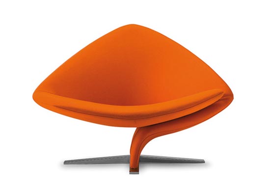
I need a thinking chair.  All I want is a comfortable chair for my office that I can use for reading, thinking, drawing, and occasionally playing a guitar.  There are literally thousands of chairs out there ... so why am I having such a tough time finding the right one?

I want something modern, relatively affordable (which is probably a large hurdle), and something that connects with me.  A lot of modern chairs are wildly imaginative and interesting but so many look hideous or I would never be caught dead in.  Here are a few such examples:


Needless to say, none of these will do ...

Tuesday, August 20, 2013

Wine Room Seating

My client has moved into an exquisite property in the Coto De Caza estates adjacent to Rancho Santa Margarita in Orange County, CA.  Their new home has a 5000 sq ft home, a 1000 sq ft pool house, and a 1200 sq ft horse barn with a classic wood saloon complete with swinging cowboy doors.  They have plans to do a complete overhaul on the barn, so I've designed a barn expansion for them which will almost double the size, but I'll cover that design in an upcoming blog post.

On their property they have a vinyard with 285 infant grape vines (80% cabernet, 10% merlot, 10% malbec), and below their house they have a wine cellar which holds approx 2200 bottles and a front room that is rigged for making and fermenting wine.  There are cabinets next to a large wood/iron wine press adjacent to a couple sinks for the wine making process ... but there is no good place to sit and enjoy the wine.  Being major wine connoisseurs, my client wants to install some type of seating for tasting wine and entertaining guests in this unique wine room.  Here is a photo of the space (the sink is to the right and the wine press and cabinets are behind the camera):


The design problem was that they wanted seating, but also needed storage for all sorts of stuff (wine glasses, fermentation equipment, bottling equipment, etc).  After presenting a couple furniture ideas, the client quickly shot down the ideas noting that it needs to be more "built-in".  Like a bench that doubles as cabinets ...

Tuesday, July 2, 2013

Logo Design Process - BoHo'62

I'm excited to talk about this project because it was a strange brew of requests that had to be boiled down to a usable logo.  First lets start off with the request in the exact words of the client:

Name of company: BoHo '62

General store feel with a baseball for the 'o's, an oil well for the H, & a battleship under the boho & 62. Maybe look like a brand for a horse?

My first question was what does the the company do???  Is this an oil company, a baseball company, a battelship company, a horse company? 

Saturday, June 29, 2013

Creative Quotes

Here are some of my favorite quotes.  Be inspired.

Thomas Edison once said, “Hell, there are no rules here; we’re trying to accomplish something.”  He also said, “To invent, you need a good imagination and a pile of junk.”  I don’t know which I like more, but those words contain a distinctive spirit of success.

Thursday, June 27, 2013

Lace Lounge #3

I finished the ottoman last night. It looks pretty good and seems to function very nicely.  The problem with testing it is that it is 14" tall at the highest point which is designed to blend perfectly with the chair which is 14" at the height of the seat. Every other chair I have is 15" tall and flat like a dinner chair, whereas this lounge chair will be more like a small chez where you sit lower and put your feet up. Since I don't have another chair that sits low like this chair will it is difficult to accurately test the comfort.

Here are photos of the final test ottoman:

Wednesday, June 26, 2013

Lace Lounge #2

If you recall from Lace Lounge #1 a few days ago, I'm building a chair but testing the design on an ottoman first.  I am currently lacing soft nylon rope through holes in two parallel pieces of plywood, much like lacing up a shoe. The catch with this lace job is that it has to be very taut or I think it will get saggy and lose its bounce. On the other hand there should be some give to soften the touch.

To maintain tension I have purchased a couple vice grips. While the large VG is pulling the rope taut by leveraging the curved head, the small VG clamps the rope so it can't return through the hole. Then the large VG are taken to the next eye hole to lever the next section of rope taut. 

After blowing through 50' of rope, here is what it's starting to look like:

Tuesday, June 25, 2013

HAPPY 161 Antoni Gaudi!!

Ya gotta love the Google doodles.  We've all seen them (whether we realize it or not).  They are the different ways the word "Google" shows up on Google's main page at google.com.  Sometimes the word Google turns into a game that can help you kill time at work.  Some the doodle is an animation that moves when you click, and sometimes it turns into a musical instrument allowing you to compose your own symphony while you have you morning coffee and check out the latest headlines.

Today, June 25, 2013, Google is celebrating Antoni Gaudi's 161st birthday with a special architectural homage to a man who revolutionized design for generations to come.  On top of that, my favorite architect, Santiago Calatrava, has said that Gaudi is one of his biggest influences and inspirations (which makes sense because they're both from Spain).  Here's the doodle: