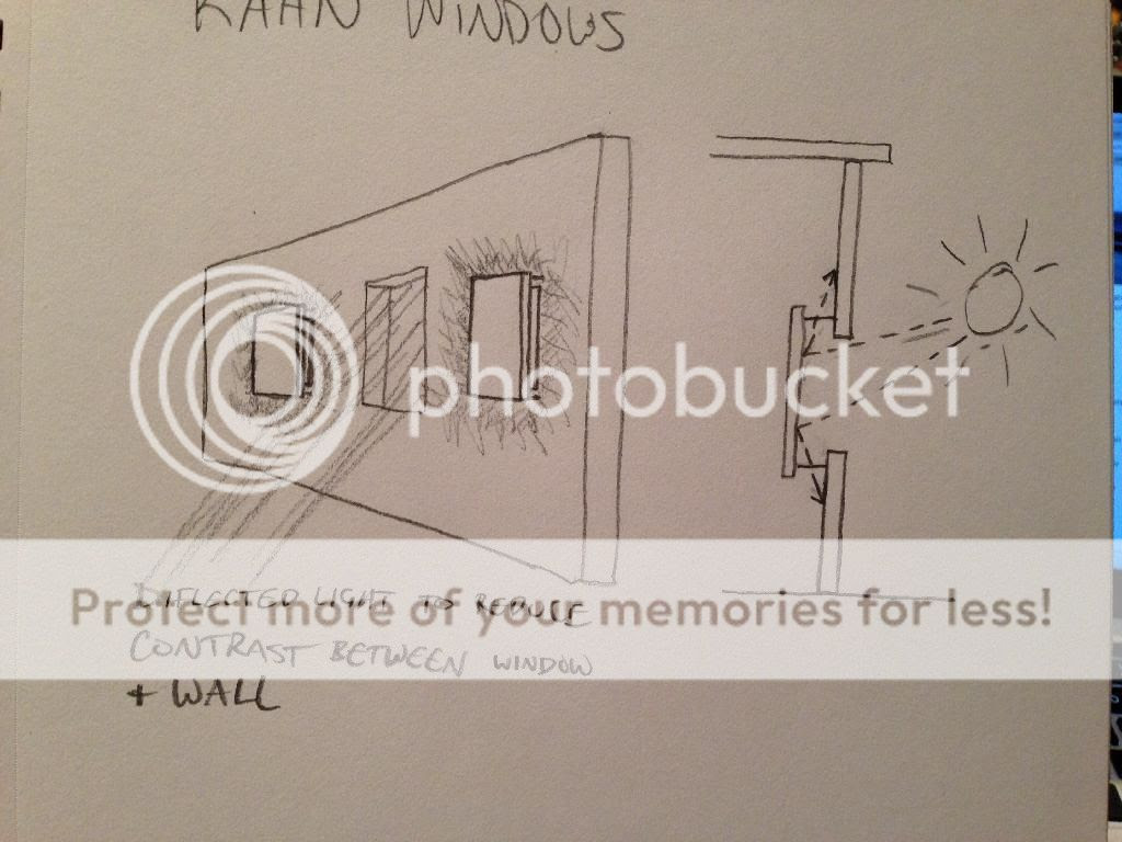
I think Louis Kahn's use of deflected light is very inspirational. He speaks about the contrast between the brightness of a window and the darkness the corresponding wall. If you were to photograph the window/wall, either the window would be in proper exposure or the wall would - not both - because the luminosity difference is too great. But what if you had a window and then to either side of the window were windows with walls in front of them? The windows with walls in front would allow light to enter and reflect off the back of the wall and shine diffused light onto the wall itself, thus reducing the contrast ratio between the brightness of the wall and the brighness of the window. In this case, if you were to photograph the wall/window, they might both be exposed.
This is an example of Kahn's execution of this concept:

Photo source: www.galinsky.com
In a way, I feel like you should be able to enhance the experience of a window if the user is not straining because of the enormous difference in foot candles between the window and the wall - I think Kahn referred to this as glaring. Here is my concept of how this could work together on a single wall:

The difference between the two examples is that I think having these 2 different elements on the same wall will also highlight the design of the wall itself. This could create new opportunities for textures, patterns, and cosmetic details.

No comments:
Post a Comment